
Chanel Shopping Center provided the backdrop for Chanel’s 2014/15 Fall/Winter Ready-To-Wear collection. The sprawling supermarket, constructed for the occasion beneath the glass roof of the Grand Palais, made for a tongue-in-cheek setting that evoked the consumerist culture imagery of Pop Art as well as the concept of easy everyday luxury. On arrival, the 3,400 guests browsed shelves stocked with goods renamed and packaged especially for the show – Chanel-branded beverages, groceries, fresh produce and home improvement supplies – before taking their seats as the 79 models began their sweep through the aisles.


The Barcode by CHANEL
“The whole thing is related to Pop Art,” Karl Lagerfeld explained, alluding to Andy Warhol’s early appropriation of mass-market commodities and packaging. Karl saw this as a development from his sensational art-gallery environment created for the spring show. “The Art one was an art supermarket, because art has become a product, no?” he explained during a fitting, reasoning that there was no better way to showcase the Chanel product than in a more literal evocation of a supermarket. Karl has a unique grasp of the contemporary Zeitgeist, and a febrile imagination that resulted in an unforgettable collection and a fashion décor that will go down in history as a tour de force of wit and invention.

“I think a little humor is needed,” said Karl, proudly noting that 500 different products had been repackaged and labeled. There were Perles de Lessive washing powders. The men’s toiletries were named for Boy Capel, Chanel’s dashing lover, and there were Les Confitures de Tante-Adrienne jams named for her aunt. There were bottles of Eau de Chanel mineral waters, and even the collection’s press photos were presented in a giant Chanel-branded matchbox.
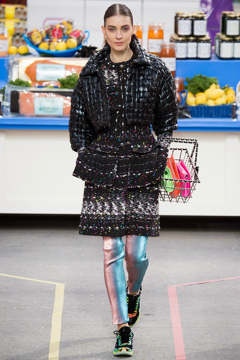
Karl Lagerfeld’s collection resonates with his resolutely modern take on the Chanel vocabulary, electrified by a distinctly urban vibe. Sneakers are the footwear of choice, paired with blazers, dresses and coats, and in knee-high lace-up boot hybrids; the models, freed from heels, had a definite spring in their step. Showcasing lively looks and slender silhouettes, the collection riffs on the richness of colors and fabrics.


Color is everywhere: in the muted tones of soft tweeds, in the bright monochrome tints of a palette of salad green, carrot orange, beet pink, and lemon yellow, in the contrasting tones of stunning geometric prints reminiscent of early 20th-century avant-garde art, and shimmering across lamé and iridescent knitwear. Black, bright silver and pewter bring clean-cut definition to these silhouettes. Tweed is featured in overcoats and oversized three-quarter-length coats, as well as starkly cut dresses and blazers. Blazers composed of four to five sections serve to define waistlines accentuated by modern zipped corsets; blazers, like dresses, are paired with slim-fit pants and leggings to create a streamlined silhouette while allowing a glimpse of the ankle. The silhouettes of the collection alternate effortless elegance with sporty looks and pared-down lines: sumptuous clean-lined trapeze and bouclé coats in quilted fabrics, short jackets in braided leather, trompe l’œil dresses, and flowing blazers with contrasting braiding. Fun accessories cheekily complete the collection: chain necklaces with metal or tweed padlocks stamped with the double C logo, cascades of pearls knotted around the neck like scarves, tweed sunglasses, black patent quilted leather shopping carts, and small purses.
Luckily, however, Karl had not exhausted his clearly inexhaustible skills in thinking up all this drollery the brilliantly colored clothes were fantastically inventive, too.


Selections by ANDREA JANKE Finest Accessories
Photo Credit/Source: The House of CHANEL & VOGUE
Photography by Kevin Tachman (Backstage)
Yannis Vlamos (VOGUE) / Indigitalimages
More To Love ...
The clothes themselves seemed more real-life than rarefied. “Life is not a red carpet,” Karl explained. “This is for daily life. I wanted color, and a fraîcheur. It’s a very happy mood.”

Tweet

No comments:
Post a Comment